DataViz Mastery Part 1 - Tree Maps
DataViz Mastery will be a series blog posts which aims to master data visualizations using Python. I am aiming to cover all visualizations in DataViz Project. In this part 1 of the series we will cover how to create Treemaps with Python.
Treemap
Treemaps display hierarchical data as a set of nested rectangles. Each group is represented by a rectangle, which area is proportional to its value. Using color schemes, it is possible to represent several dimensions: groups, subgroups… Treemaps have the advantage to make efficient use of space, what makes them useful to represent a big amount of data.
Examples


The Code
We will use the data of Star Wars Movie Franchise Revenue from Statistic Brain. squarify is a Python module helps you plot Treemaps with Matplotlib backend. Seaborn is another data visualization library with Matplotlib backend. Seaborn helps you create beautiful visualizations. You can interact with Seaborn in 2 ways.
- Activate and Seaborn and Use Matplotlib
- Use Seaborn API
Since, Seaborn doesn't have Treemaps API, we will use 1st option.
If you are unfamiliar with Matplotlib, read this my introductory post.
# Data Manipulation
import pandas as pd
# Treemap Ploting
import squarify
# Matplotlib and Seaborn imports
import matplotlib
from matplotlib import style
import matplotlib.pyplot as plt
import seaborn as sns
# Activate Seaborn
sns.set()
%matplotlib inline
# Large Plot
matplotlib.rcParams['figure.figsize'] = (16.0, 9.0)
# Use ggplot style
style.use('ggplot')
We have imported necessary modules to generate Treemap. Now let's import out dataset.
# Reading CSV file
df = pd.read_csv("starwars-revenue.csv")
# Sort by Revenue
df = df.sort_values(by="Revenue", ascending=False)
# Find Percentage
df["Percentage"] = round(100 * df["Revenue"] / sum(df["Revenue"]), 2)
# Create Treemap Labels
df["Label"] = df["Label"] + " (" + df["Percentage"].astype("str") + "%)"
df| Movie | Revenue | Label | Percentage | |
|---|---|---|---|---|
| 6 | Episode 7 – The Force Awakens | 4068223624 | The Force Awakens (37.68%) | 37.68 |
| 7 | Rogue One | 2450000000 | Rogue One (22.69%) | 22.69 |
| 0 | Episode 1 – The Phantom Menace | 924317558 | The Phantom Menace (8.56%) | 8.56 |
| 2 | Episode 3 – Revenge of the Sith | 848754768 | Revenge of the Sith (7.86%) | 7.86 |
| 3 | Episode 4 – A New Hope | 775398007 | A New Hope (7.18%) | 7.18 |
| 1 | Episode 2 – Attack of the Clones | 649398328 | Attack of the Clones (6.01%) | 6.01 |
| 4 | Episode 5 – Empire Strikes Back | 538375067 | Empire Strikes Back (4.99%) | 4.99 |
| 5 | Episode 6 – Return of the Jedi | 475106177 | Return of the Jedi (4.4%) | 4.40 |
| 8 | The Clone Wars | 68282844 | The Clone Wars (0.63%) | 0.63 |
That's out dataframe. Now Let's Plot it.
# Get Axis and Figure
fig, ax = plt.subplots()
# Our Colormap
cmap = matplotlib.cm.coolwarm
# Min and Max Values
mini = min(df["Revenue"])
maxi = max(df["Revenue"])
# Finding Colors for each tile
norm = matplotlib.colors.Normalize(vmin=mini, vmax=maxi)
colors = [cmap(norm(value)) for value in df["Revenue"]]
# Plotting
squarify.plot(sizes=df["Revenue"], label=df["Label"], alpha=0.8, color=colors)
# Removing Axis
plt.axis('off')
# Invert Y-Axis
plt.gca().invert_yaxis()
# Title
plt.title("Revenue from Star Wars Franchise Movies", fontsize=32)
# Title Positioning
ttl = ax.title
ttl.set_position([.5, 1.05])
# BG Color
fig.set_facecolor('#eeffee')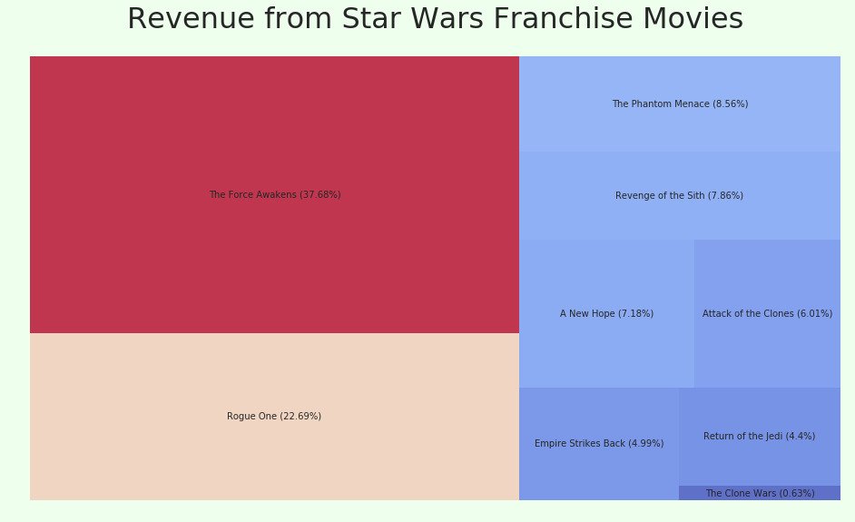
If you want to try different colormap, find a colormap of your choice from Matplotlib Docs and replace 2nd line in this snippet. Now Let's try plotting World's top 10 Billionaires net worth.
# Reading CSV file
df = pd.read_csv("rich.csv")
# Label
df["Label"] = df["Name"] + " - $" + df["Net Worth in Billion $"].astype("str") + "B"
df| Name | Net Worth in Billion $ | Label | |
|---|---|---|---|
| 0 | Bill Gates | 86.0 | Bill Gates - $86.0B |
| 1 | Warren Buffett | 75.6 | Warren Buffett - $75.6B |
| 2 | Jeff Bezos | 72.8 | Jeff Bezos - $72.8B |
| 3 | Amancio Ortega | 71.3 | Amancio Ortega - $71.3B |
| 4 | Mark Zuckerberg | 56.0 | Mark Zuckerberg - $56.0B |
| 5 | Carlos Slim Helu | 54.5 | Carlos Slim Helu - $54.5B |
| 6 | Larry Ellison | 52.2 | Larry Ellison - $52.2B |
| 7 | Charles Koch | 48.3 | Charles Koch - $48.3B |
| 8 | Davis Koch | 48.3 | Davis Koch - $48.3B |
| 9 | Michael Bloomberg | 47.5 | Michael Bloomberg - $47.5B |
# Change Style
style.use('fivethirtyeight')
fig, ax = plt.subplots()
# Manually Entering Colors
colors = ["#248af1", "#eb5d50", "#8bc4f6", "#8c5c94", "#a170e8", "#fba521", "#75bc3f"]
# Plot
squarify.plot(sizes=df["Net Worth in Billion $"], label=df["Label"], alpha=0.9, color=colors)
plt.axis('off')
plt.gca().invert_yaxis()
plt.title("Net Worth of World's Top 10 Billionaires", fontsize=32, color="Black")
ttl = ax.title
ttl.set_position([.5, 1.05])
fig.set_facecolor('#effeef')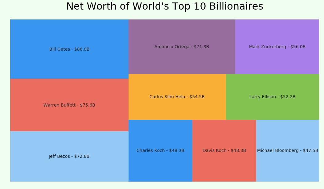
That concludes the part 1 of DataViz Mastery. Let me know if you have any questions. In the next DataViz Mastery post we will learn how to create Word Clouds using Python
Checkout this Github Repo for more visualizations.
Data Visualization Books
- Storytelling with Data: A Data Visualization Guide for Business Professionals
- The Truthful Art: Data, Charts, and Maps for Communication
- Data Visualization: a successful design process
- Data Visualisation: A Handbook for Data Driven Design